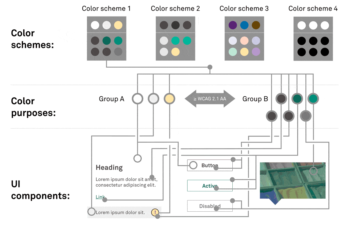
Color System
Rather than referencing specific color values when styling UI components, all UI components in gravity-ui-web instead reference one of the color purposes defined by the Gravity design system. Then, one of Gravity’s color schemes assigns color values to the various purposes and all UI components take on that scheme’s colors.
Multiple color schemes are defined in gravity-ui-web and consumers can add their own additional ones. A default color scheme is applied to pages automatically. However, using some utility classes, different color schemes can be applied to the page or any container within it. The colors of all UI components within then change accordingly.
This decoupling of UI components and color values means that all UI components (now and in the future) can work with all color schemes. This completely eliminates the need for different color variants of UI components as commonly found in other UI libraries.
Applying color schemes to a page or container
gravity-ui-web provides a number of grav-u-color-scheme-* CSS classes which can be applied to any container element, or the <html> if you want to change the color scheme of the whole page. They will set the color and background-color of the container as per the chosen color scheme and also alter the colors of all UI elements within.
You can nest containers with different color schemes. For instance, you could have a dark section on a light page and that dark section can then have a light sub-section within it.
Styling UI components
As described in the intro, Gravity’s UI components never have explicit color values applied to any of their styling properties. Instead, they must always reference one of the available color purposes, which are implemented as CSS custom properties. SASS mixins are also available to do so with a backwards-compatible default color values for older browsers that do not support custom properties. Within gravity-ui-web‘s own code, the SASS mixins are the preferred way to apply colors:
.grav-c-cool-thing {
  // Applies the group A accent color purpose to the
  // background-color property, and adds a fallback value
  // using the default color scheme's group A accent color
  // value.
  @include grav-color-apply('a', 'background-color', 'accent');

  // Applies the group B accent color purpose to the color
  // property, but omits the fallback.
  @include grav-color-apply('b', 'color', 'accent', false);
}
The CSS output of the above code would be something like this:
.grav-c-cool-thing {
  background-color: #ffffff;
  background-color: var(--grav-co-grp-a-accent);

  color: var(--grav-co-grp-b-accent);
}
Color purpose groups
Color purposes have been divided into 2 groups: Group A and group B. Every color scheme must assign colors in such a way that the contrast ratio between any group A and any group B color will be at least WCAG 2.1 AA standard (for large text), i.e. 3:1. (There is no requirement on the constrast ratios between pairs of colors from the same group, and typically these will be quite low.)
Therefore, whenever an element of a UI component needs to be perceivable against it’s surroundings, a color from the other group should be applied. For instance, if the current background color is a group B color, then any text on that background should use a group A color.
Finally, when a color scheme is applied to a page or container, its background-color will always be set to var(--grav-co-group-a-neutral) (group A), and its color will be set to var(--grav-co-group-b-neutral) (group B). Therefore you can always assume that the surrounding background around your UI component will be group A.
Available color purposes
Group A
| Name | CSS custom prop | Purpose |
|---|---|---|
| neutral | --grav-co-grp-a-neutral |
Base neutral color. (Note: Color schemes automatically apply this as the container’s background-color.) |
| neutral-alt | --grav-co-grp-a-neutral-alt |
Alternative neutral color to be used for subtle, NON-ESSENTIAL, effects. For example banding alternate table rows |
| accent | --grav-co-grp-a-accent |
Accent color for elements that should draw the user’s focus. |
| accent-success | --grav-co-grp-a-accent-success |
Accent color for elements that indicate success or completion. |
| accent-attention | --grav-co-grp-a-accent-attention |
Accent color for elements that require the user’s attention. |
| accent-danger | --grav-co-grp-a-accent-danger |
Accent color for elements that indicate danger or risk. |
Group B
| Name | CSS custom prop | Purpose |
|---|---|---|
| neutral | --grav-co-grp-b-neutral |
Base neutral color. (Note: Color schemes automatically apply this as the container’s color.) |
| neutral-subtle | --grav-co-grp-b-neutral-subtle |
Alternative neutral color to be used for non-interactive items that need to visually stand out less against their surroundings. |
| neutral-emphasis | --grav-co-grp-b-neutral-emphasis |
Alternative neutral color to be used for non-interactive items that need to visually stand out more against their surroundings. |
| control | --grav-co-grp-b-control |
Color intended for interactive controls (links, buttons, etc.) that need to be visually distinguishable against their surroundings. |
| control-alt | --grav-co-grp-b-control-alt |
Color intended for an alternative state or type of interactive control. For example, a visited link. |
| control-emphasis | --grav-co-grp-b-control-emphasis |
Color intended for states of interactive controls that need to be visually emphasised somehow. Typically this will be used for hover and/or focus states. |
| control-active | --grav-co-grp-b-control-active |
Color intended for the active state of interactive controls. |
| control-disabled | --grav-co-grp-b-control-disabled |
Color intended for the disbaled state of interactive controls. |
| accent | --grav-co-grp-b-accent |
Accent color for elements that should draw the user’s focus. |
| accent-success | --grav-co-grp-b-accent-success |
Accent color for elements that indicate success or completion. |
| accent-attention | --grav-co-grp-b-accent-attention |
Accent color for elements that require the user’s attention. |
| accent-danger | --grav-co-grp-b-accent-danger |
Accent color for elements that indicate danger or risk. |
Creating and modifying color schemes
The color schemes themselves are actually defined in the gravity-particles repo. At build-time, gravity-ui-web imports the exported Gravity Particles SCSS and creates corresponding CSS utility classes.
Note: Color schemes may apply the same color value to multiple purposes. The only requirement is the WCAG 2.1 AA minimum color contrast ration between all possible group A and group B pairings.